







Amplify
Motion branding for AppLovin
Introduction
The reason I have selected this project for study is that the brief, challenges and the output for this project where all rather unconventional. Essentially I received a small visual toolkit and very little direction, and was tasked with creating some short, looping branding videos using a limited selection of graphic elements, the logo and a fixed, highly vibrant colour palette, that would be shown on screens across the world during multiple events.
From these relatively simple ingredients, I needed to create something that felt dynamic, energetic and substantial enough to work as event branding, that conveyed the idea of ‘amplification’, and could be adjusted and amended to fit multiple screen sizes and ratio’s, that would not be known precisely until days (and in one case hours) before the events take place.
The brief
Limited creative assets
I had to work within the supplied visual language rather than introducing new graphics or colours.





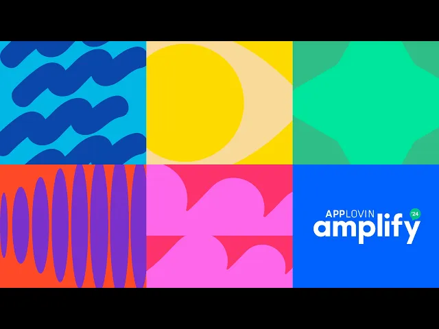
This was the extent of the assets that were handed to me.
The creative challenge
The central idea was amplification.
Rather than illustrating the word literally, I explored how the idea could be expressed through the behaviour of the graphics themselves. Elements grow, expand, repeat, move etc...
Unpredictable formats
The exact screen dimensions could vary from event to event and, in some cases, wouldn't be confirmed until only a few days before delivery. The only screen I was made aware of being: 4992 × 1536px
This meant the solution needed to do more than simply look good in one format. It needed to become a flexible motion system that could be adapted quickly without losing its identity.
The approach
From static assets to motion
Rather than treating the supplied graphics as individual illustrations, I looked at how they could interact, transform and build on one another.
I developed this into a modular ‘Bento-Box’ system where shapes could expand from individual panels into full-screen moments, then transition back into the wider composition. Movement, repetition and scale became the main tools for expressing the idea of amplification.
The bento-box structure also gave me a practical framework for adapting the animation to different screen formats at short notice.
Storyboarding & Refinement
With the overall direction established, I developed the animation through a series of storyboards, using them to explore pacing, transitions and how the individual graphic elements could work together.
The first iteration focused on establishing the basic structure and sequence. I then refined the animation through further revisions, simplifying and reshaping transitions, adjusting the movement of individual elements and exploring how the different sequences could flow naturally back into the modular layout. This included wishes from the Creative Director, which I was more than happy to implement.
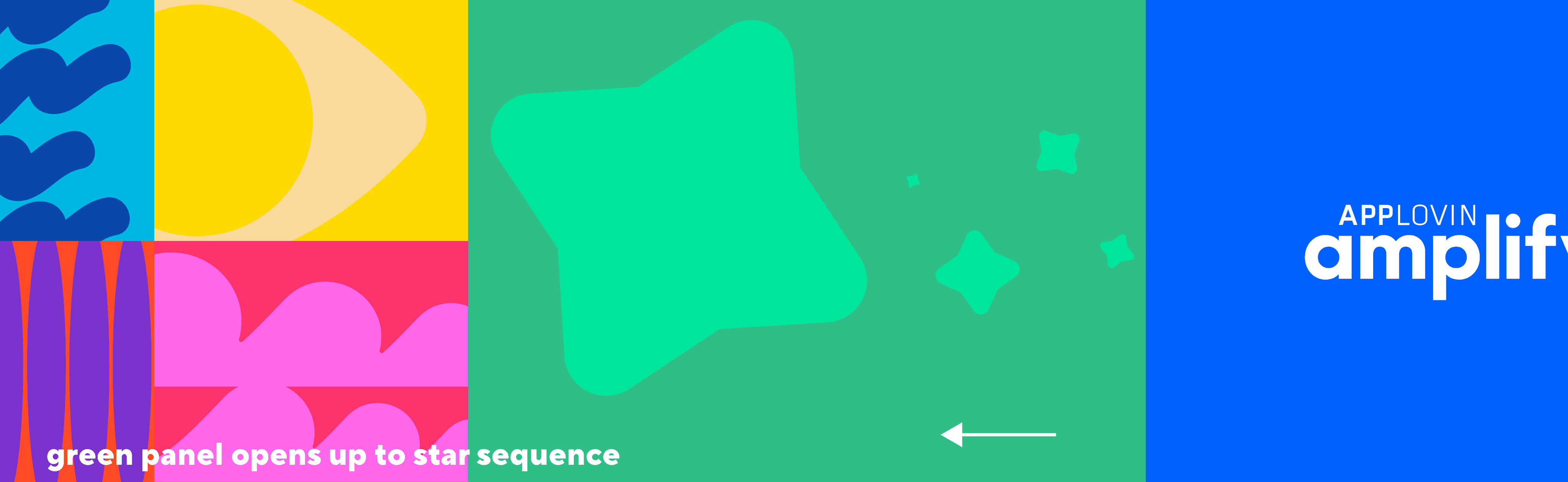
The final storyboard reflects this evolution, including changes to the order, pacing and behaviour of elements such as the eye, stars, waves and soundwave.
——>
Adapting the system
Multiple formats. One visual system.

The outcome
The final animation was delivered in multiple formats to work across the different screens used at AppLovin’s Amplify events.
The modular system allowed me to adapt the composition for standard 16:9 displays, narrow portrait screens and ultra-wide formats, while keeping the same core animation language and visual identity.
Rather than simply resizing one video, I could recompose the individual elements for each format, making the animation feel considered across very different display environments.